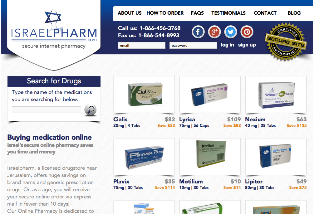
ISRAEL PHARM
IsraelPharm returned to me 10 years after I worked with them to develop their initial brand and website. The business has enjoyed steady growth since it’s inception and it recently came the time for them to give everything a refresh.
LOGO DESIGN 2010 + 2020
HOME PAGE DESIGN 2010 + 2020
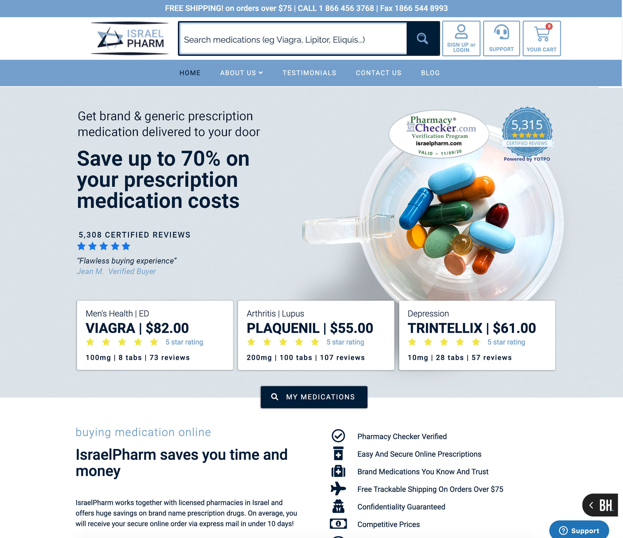
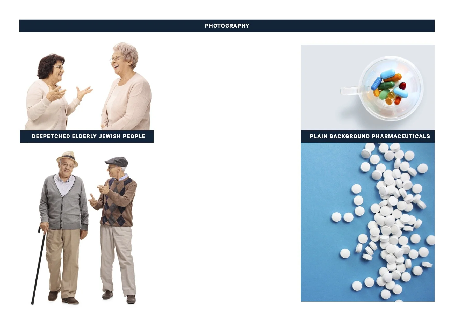
Being an e-commerce business, the IsraelPharm team had great knowledge of their customers’ demographics, habits and behaviours. This made for a very clear brief for look, feel, visual hierarchy and usability. Bear in mind that the target audience are over 50 Jewish Americans when viewing (and judging) these designs.
It’s a given that mobile screen sizes need to be considered in all web design these days. However given the demographic and their slower uptake of mobile e-commerce purchasing and general mobile browsing, it was imperative that usability was as easy as possible whilst maintaining important brand messaging.
HADASSAH MAGAZINE FULL PAGE PRINT AD

Implementing Jewish humour into their regular print advertising was a decision made to maintain brand presence and messaging without pushing a hard-sell or agenda. It has so far performer very well.
BRAND GUIDELINES


BANNER ADS


MEDICATIONS FOR MEN
medicationsformen.com engaged me to develop their brand identity for their topical testosterone product.
This resulted in providing a mini style guide and home page UX design.


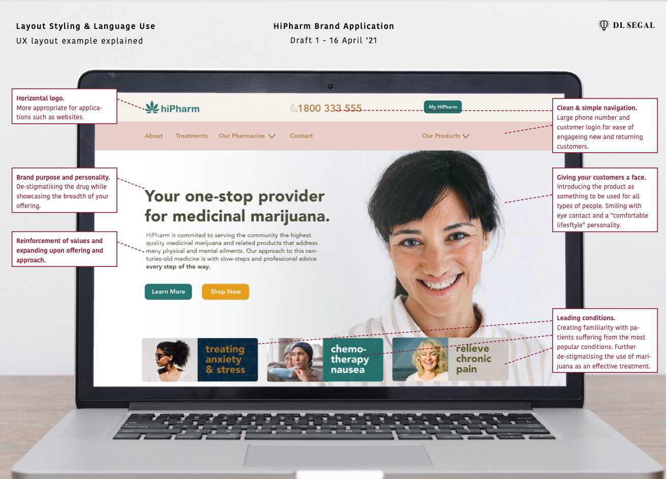
HI PHARM
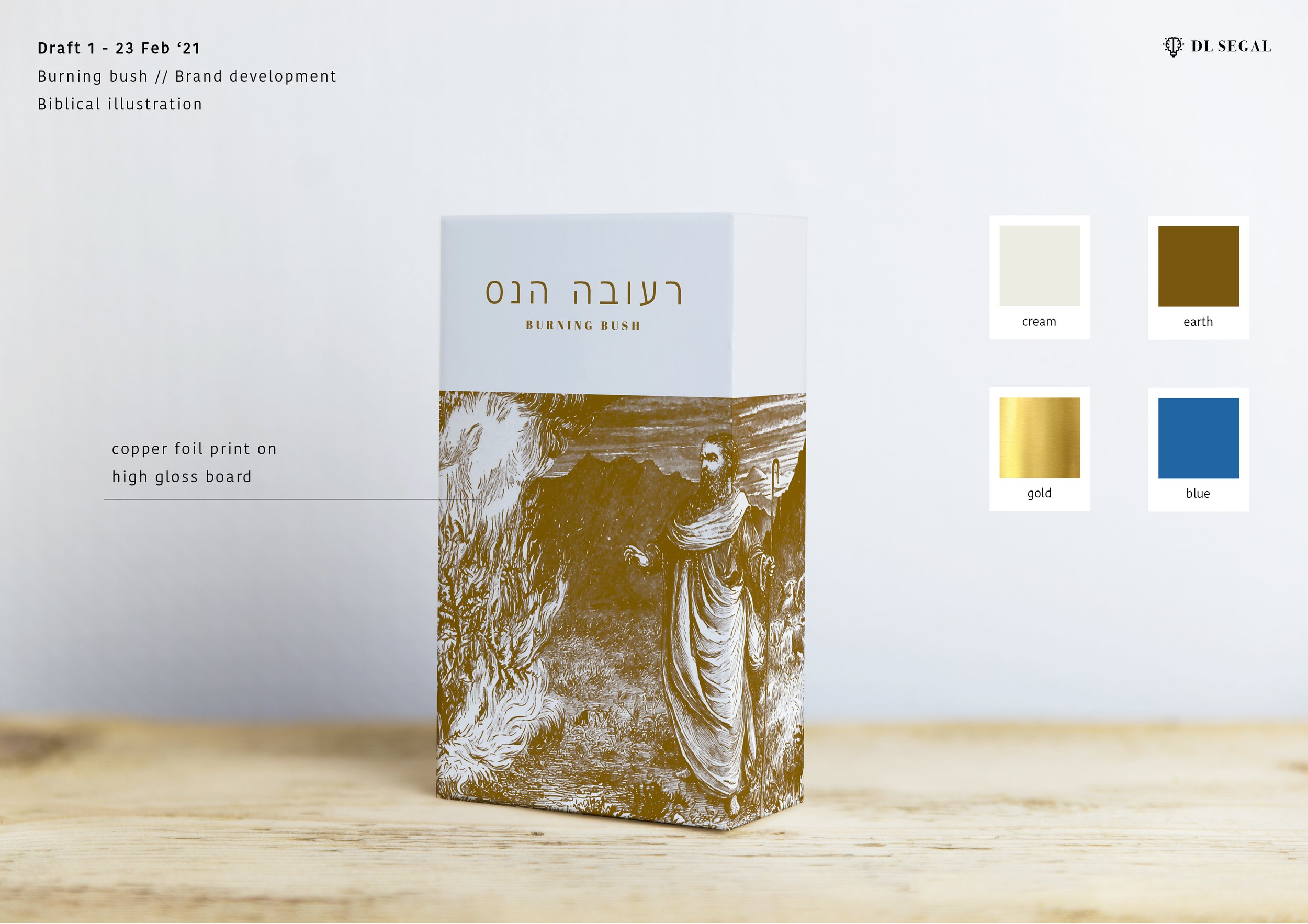
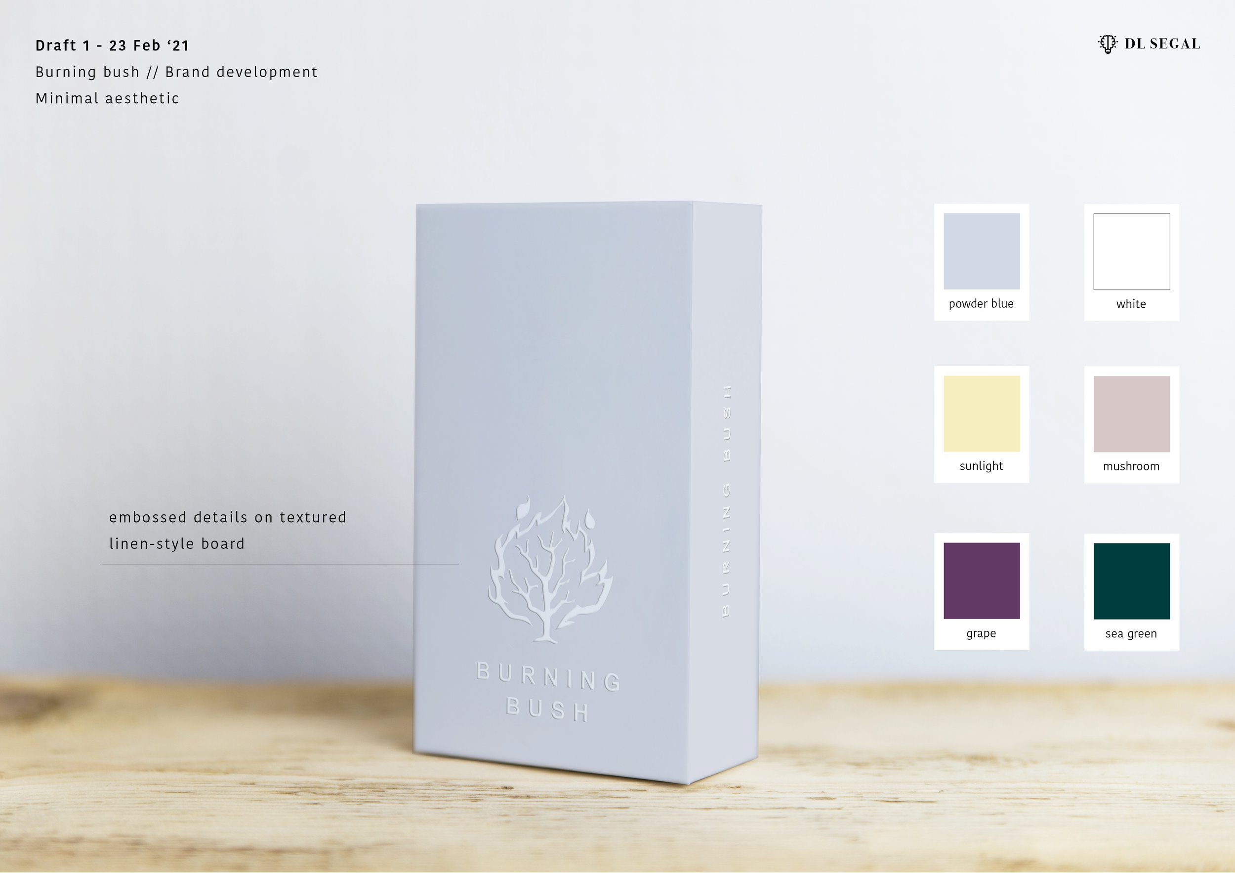
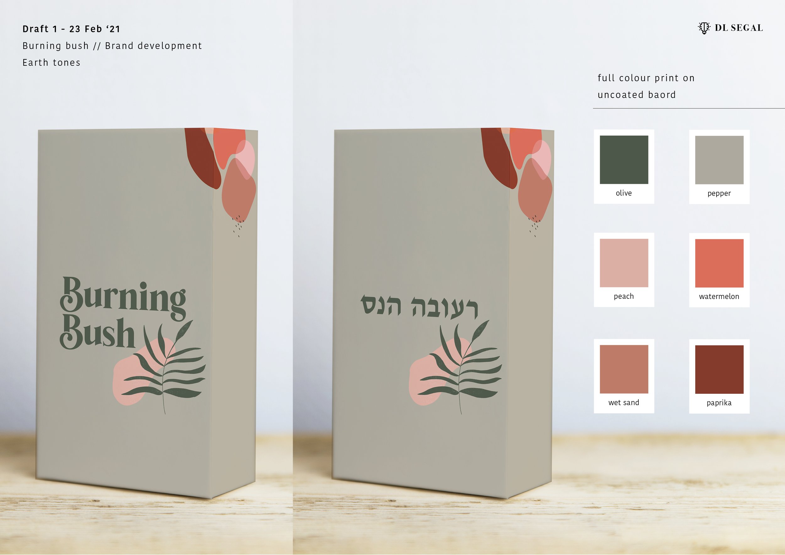
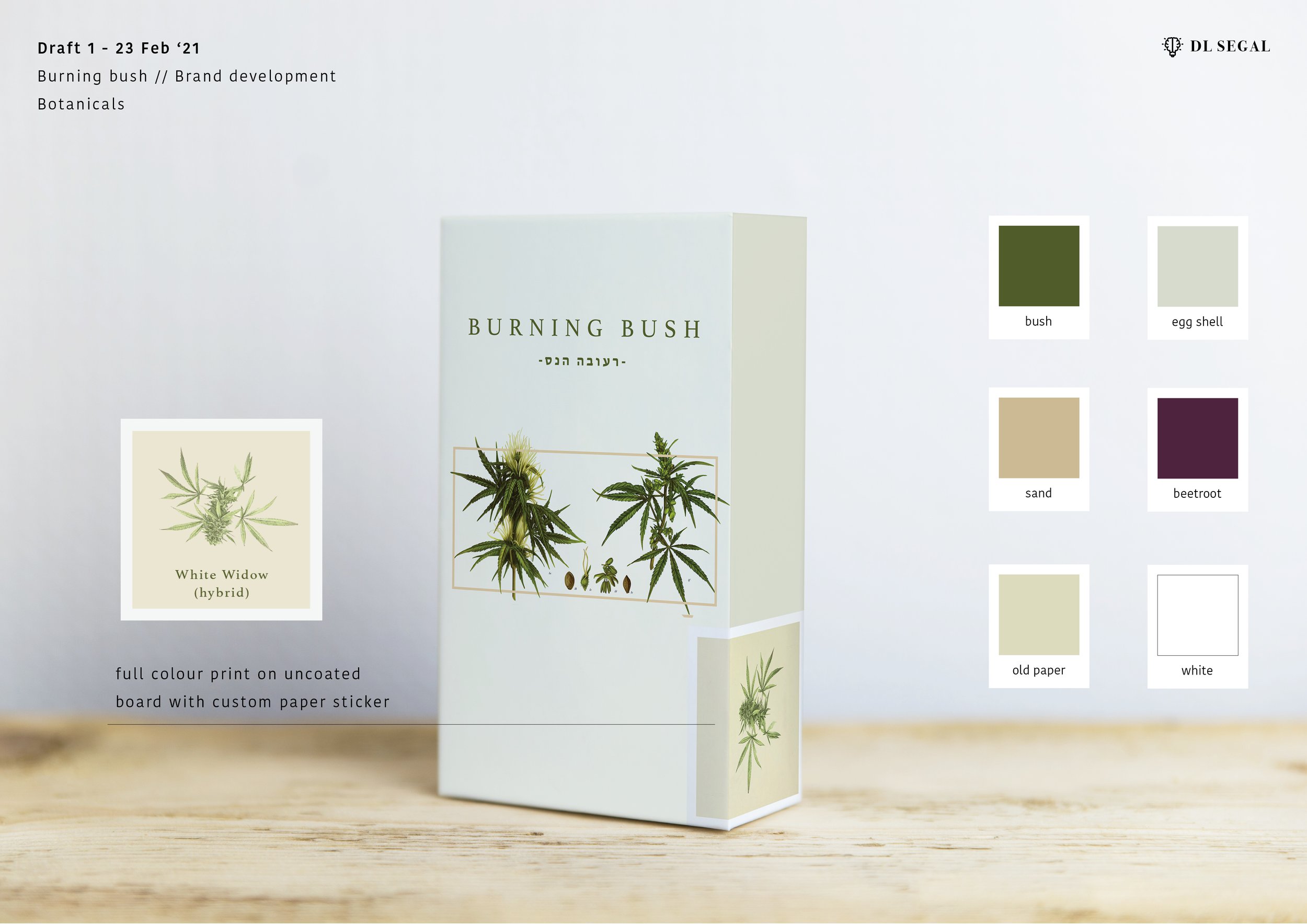
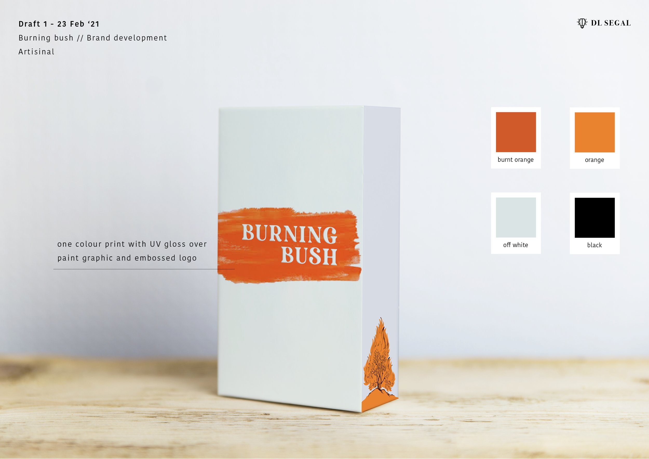
World leading online pharmaceutical company has expanded into cannabis clinics in Israel. I was engaged to develop the clinic branding, signage and in-house hero product, “Burning Bush”. A very fun an interesting start-up to be a part of.

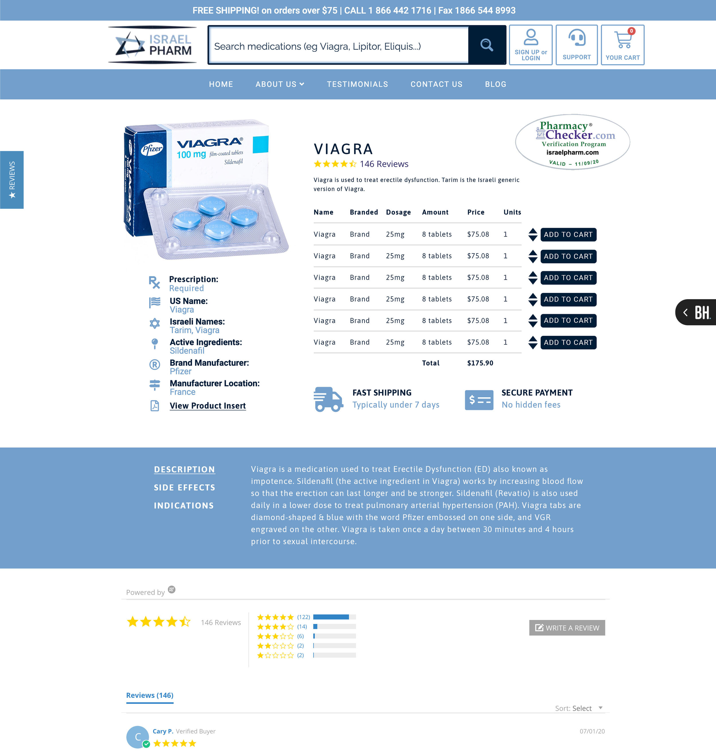
HOMEPAGE UX DESIGN (with explanations)


Shopping Bag

Treatment Guide
HOUSE BRAND DEVELOPMENT
I approached this brief with devising 5 completely different visual directions and placed them onto product boxes so the client could get a clear idea of the concept and how it would translate to production.